
RFPIO is now Responsive. That’s the headline, but it’s not the whole story. We’re excited to share the details of our journey including why we made the change, how we got here, what’s next and an inside look at our brand evolution.
From RFPIO to Responsive: The story behind the brand
Built on a shared vision to transform the way that businesses exchange information, Ganesh Shankar, AJ Sunder and Sankar Lagudu founded RFPIO in 2015. Armed with insights from first-hand experiences and their collective expertise in product management, software development and operational excellence, they set to work bringing RFPIO to life.
In the intervening years, a lot has happened within RFPIO, our industry and the world. We’ve grown along with our customers, pioneered industry best practices and watched as the world embraced digital transformation.
We’ve always known that technology could deliver faster, better RFP responses that result in increased win rates and revenue. But RFPs are just the beginning. In the current global landscape, our customers need to be able to manage responses of all kinds with unparalleled efficiency, accuracy and confidence. And with our platform, they do.
Since the beginning, customers have leveraged RFPIO to respond to all kinds of requests. We work with people in all roles, at all levels within a business. Sales and marketing teams create proposals and answer RFPs, RFQs and RFIs to win business. Security teams answer vendor risk assessments and SIG questionnaires to share vital information. Legal teams collaborate on due diligence questionnaires to illuminate and secure game-changing transactions. And crucially, we work with the CEOs, CTOs, CFOs and CROs who are seeking a single, unifying way to remove roadblocks for their teams and drive growth.
We believe that anyone who responds to any kind of query or question deserves to have a way to do that as efficiently and effectively as possible while protecting their organization from risk and ensuring compliance. Our new name, Responsive, reflects that core belief.
We empower every user, regardless of their position or department, to answer questions once and save their valuable time and energy for doing what’s most important to them. Our brand needed to more accurately embody that holistic sense of collaboration, clarity and efficiency.
This is more than just a new name and logo. It signals our deeper understanding of the fundamental human connection between colleagues, partners and organizations. You’ll see this evolution take shape in the way Responsive looks, how we communicate and how we develop our platform.
Being Responsive

Ganesh Shankar
Chief Executive Officer
As Chief Executive Officer and co-founder of RFPIO, now Responsive, Ganesh Shankar leads by example. In partnership with co-founders AJ Sunder (CPO/CIO) and Sankar Lagudu (COO), Ganesh models the foundational company values established at the company’s inception — notably a dedication to serving customers, employees and shareholders.
This focus has remained constant as the company has grown. It’s manifested in long-term customer relationships, countless awards and a reputation for innovation. Driven to fulfil the company’s mission and realize our vision, Ganesh sees the new brand as the next stage in our evolution.
Why is RFPIO now Responsive? Why is the company name changing?
GS: When we selected the name RFPIO, it served us well. We needed a name that was short and meaningful. Because our mission was to make RFPs as simple and easy as inputs and outputs, RFPIO was the perfect fit. It made it immediately apparent to anyone we talked to what we were all about.
In the years since then, we’ve grown and seen customers use RFPIO beyond RFPs. The platform allows them to be collaborative and compliant working with the right people internally. They are able to minimize risk and redundancies to become more efficient and effective.
We’re helping customers streamline and manage all of their strategic responses. We knew we needed a name that reflected the broader value of the platform. Shifting from RFPIO to Responsive reflects that holistic approach to the larger organizational need for strategic response management.
Why now?
GS: Given the challenging global economy, where everyone is expected to do more with less, we have a solution that helps our customers do just that. We want our customers to realize the highest possible ROI using the platform and that means leveraging its capabilities to answer more than RFPs. So this repositioning helps to communicate that.
Why did the name Responsive resonate?
GS: Responsive is more than a name, it’s a character trait. That really resonated with us because we’ve always been responsive.
One of our values is to be agile and nimble. To us, that means seeing what our customers need, hearing their feedback and putting it into action. We’ve been successful because of our dedication to launching high-quality products and features quickly to delight our customers — another one of our values. So, the name Responsive automatically clicked with us. It reinforces how we want our teams to be. We want them to always have the customer’s success in mind.
The name is also a reminder of how we will continue to be successful in the future — being responsive to our customer, employee and shareholder needs. All three are necessary, and the name speaks to each.
What can customers expect from Responsive moving forward?
GS: Our commitment to customers is the same — to always be responsive. It’s part of our company culture and will continue to be. We will continue to deliver the value our customers deserve and depend on. It’s really that simple.
What does the future look like for Responsive?
GS: When envisioning the future after our rebranding, we recognize that our customers, investors and employees are at the heart of our success.
For our customers, this rebrand signifies an enhanced commitment to delivering exceptional experiences, best-in-class solutions and exceeding their expectations. We will continuously listen to their feedback, adapt to their evolving needs, and offer innovative products and services that improve their lives.
To our investors, the rebrand showcases our strategic vision and the potential for long-term growth and profitability. We are dedicated to maximizing shareholder value by leveraging our reimagined brand to capture new market opportunities, drive revenue growth, and maintain a solid financial foundation.
Our employees are integral to our future success. The rebranding reflects our unwavering commitment to providing a great place to work with a culture of collaboration and innovation.
Overall, our rebranding signals a future where we build deeper connections with our customers, forge strong partnerships with investors and cultivate a thriving community within our organization. Together, we will create a shared future marked by growth, prosperity and collective achievement.
Finally, what does it mean to you to be Responsive?
GS: Personally, I take our commitment to our customers very seriously. When a customer signs up, we are committing to empowering their success. The word responsive directly reflects that focus and fuels that drive to help our customers meet their goals.
According to our customers, we've always been Responsive.
“RFPIO’s team is so cooperative and responsive! Their goal is to truly be a partner to us in our RFP efforts.” — Lauren, Customer review from Software Advice
“The feature set continues to grow and RFPIO is very responsive to customer feedback.” — John, Customer review from G2
“Whether we enter a support ticket or email with our account representative, the team is 100% responsive and ensures that our question/need is addressed … I could not ask for a better vendor partner.” — Andrew, Customer review from G2
“Everything about our experience has been extremely positive. From the outset they were responsive and attentive." — Customer review from G2
“RFPIO’s customer support and account management teams are extremely responsive, pleasant, helpful and have ensured a seamless implementation/adoption at every step of the way.” — Jesse, Customer review from Capterra
Becoming Responsive

Michael Londgren
Chief Marketing Officer
As Chief Marketing Officer, Michael Londgren draws from decades of executive experience guiding strategy and scaling world-class technology businesses. He has a passion for taking businesses to the next level and a proven track record.
His approach leverages his past successes building category-leading brands, delivering value to customers and driving hypergrowth. Michael empowers cross-functional collaboration and alignment, organizational excellence and innovative thinking — crucial skills for successfully shifting from RFPIO to Responsive.
What’s the ultimate goal for rebranding the company?
ML: The ultimate goal for rebranding to Responsive is to properly position the company given its expanded value proposition supporting multiple use cases. The name RFPIO served the company well early on when the primary use case the company focused on was RFPs. The platform has since expanded to support not only RFPs but security questionnaires, DDQs, RFIs and many other kinds of information requests. So, we needed a name that more holistically reflects our business-wide value proposition.
Generally, I wouldn’t recommend rebranding a company that already has such a strong brand and commanding presence in the market. But, in our case, the company has grown to support so many other important use cases that an RFP-centric name no longer accurately represented the tremendous value the platform delivers.
How are you thinking about the category Responsive participates in?
ML: In our view, Responsive is the breakout leader in an emerging new category called Strategic Response Management (SRM). In fact, Aragon Research just published THE seminal paper on SRM titled Getting to Faster Business Results with SRM. Aragon’s paper does a wonderful job identifying the emergence of this new category, highlighting SRM’s value proposition, and arguing that SRM is the “next must have GTM solution.”
We are thrilled Responsive was named as pioneering the category and to see capabilities we deliver as core to a best in class SRM solution. We also feel that our Responsive name is more reflective of our overall leadership position in the category given the breadth of use cases we support.
A rebrand is a big undertaking. Where did you start?
ML: Our rebranding journey started with the realization at our executive leadership team level that we’d outgrown the RFPIO name. RFPIO had served us incredibly well early on because it did a nice job communicating what we were about: RFPs. However, it’d become clear that the name had become limiting and not reflective of our overall value proposition.
Once our team aligned on that realization, we pulled in an award-winning agency, Barrett Hofherr to assist us with our rebranding efforts. B/H helped us drive a process whereby we explored and refined our vision, mission, and value proposition while also coming up with a new company name and visual identity.
When looking for a new name, what were the criteria?
ML: We wanted a name that reflected our value proposition. It also needed to be authentic to our team and culture. It needed to be simple, memorable and available. Beyond that it needed to work on a global scale communicating value across all countries, segments, industries and use cases.
The process we went through with B/H was thoughtful and thorough. You’ll laugh, but we actually built a model to weigh different options against these and other criteria to help inform our naming decision. When we landed on Responsive, we vetted both the name and logo extensively — with internal stakeholders as well as external customers, partners, analysts and other ecosystem partners.
What else did you do? Walk us through the process.
ML: While exploring name and then logo options, the team began working cross functionally to build the activation plan for the brand both internally and externally. This plan included sharing updates with our internal teams and the company as a whole over the course of our journey (and incorporating a lot of feedback along the way), developing and refining messaging, hosting internal brand workshops, building a new website, updating core materials, and outlining our roll-out strategy including website launch, PR announcement and social campaign.
Moving forward, what we’re most excited about is truly bringing the Responsive brand to life through the voice of our customers as they increasingly adopt our platform and get value across a number of use cases in their business.
How have people reacted to the name?
ML: People across the board have reacted very positively. When we unveiled Responsive internally during a company-wide all hands meeting as our proposed new name, it was very exciting to see the Zoom chat light up with dozens of positive reactions to the news. When that happened, we knew we had a winner and had landed on the right spot.
Similarly, customers, stakeholders and experts that we’ve shared the name with have reacted positively as well. They agree that it’s more reflective of the overall value proposition.
What does Responsive mean to you?
ML: To me, to be responsive means to be empathetic, truly understand needs and respond accordingly. That’s what we do. That’s who we are.
Responsive is a natural evolution from our beginnings. The name reflects the fact that we’re helping organizations respond across the board to information requests. But, importantly, it also signifies being interactive with customers and truly working to meet their needs.
Responsive perfectly embodies our team and culture, the value proposition we’re extending to customers and the value proposition we enable our customers to extend to their audiences while using our platform.
Looking Responsive

Wil Dimpflmaier
Creative Director
As Creative Director, Wil Dimpflmaier was tasked with transforming the new name from a simple word and concept into a memorable, engaging and cohesive visual brand identity — no easy feat. The new look needed to represent the evolution from RFPIO to Responsive, staying true to the foundational ethos of the company.
Working with a team of talented designers and B/H while drawing inspiration from the sense of momentum and connection inherent in the Responsive name, the brand began to take shape.
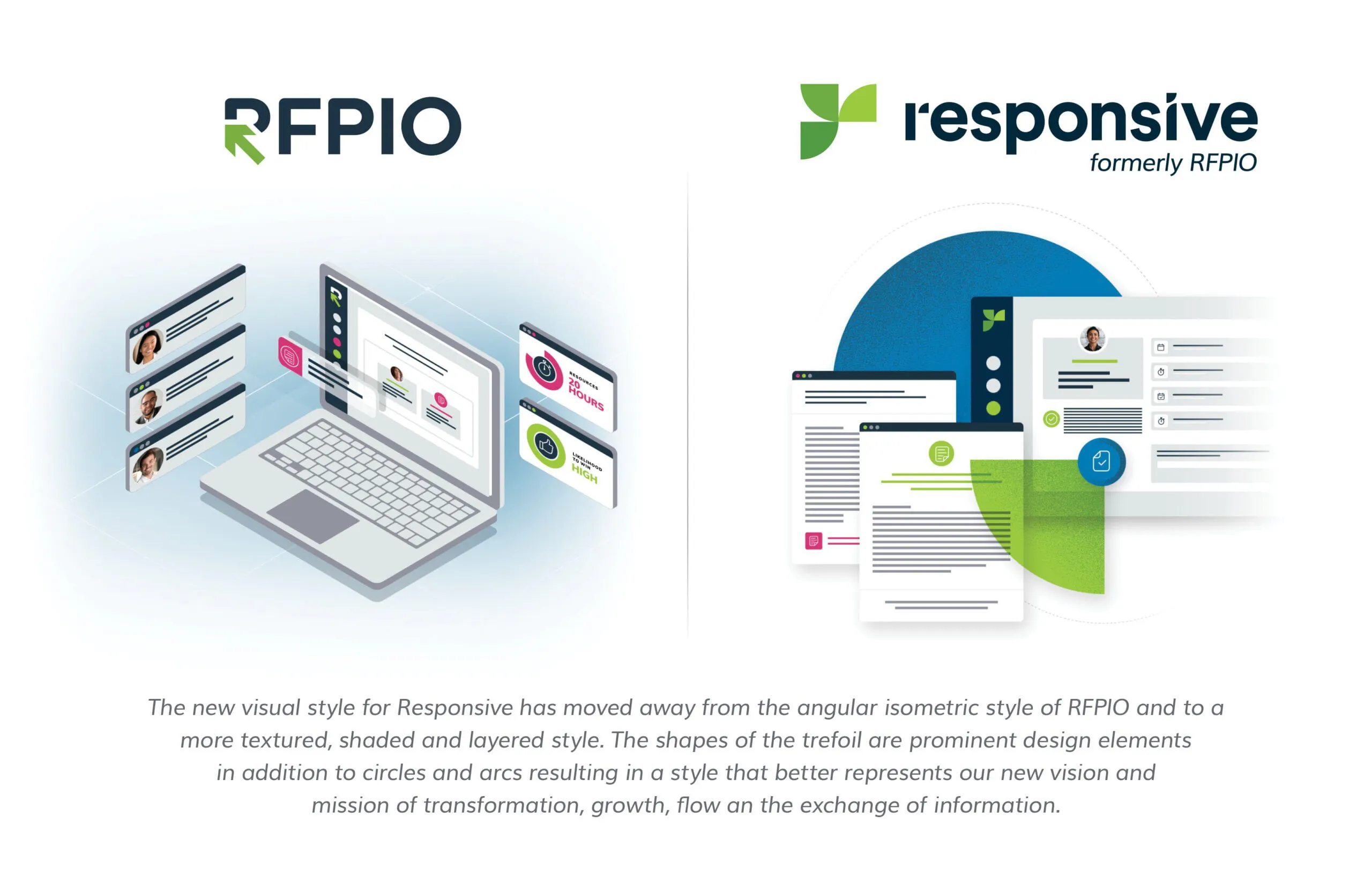
The end result? A look that feels excitingly fresh, but reassuringly familiar. Drawing from previous design elements and embracing the bold colors, dimensional layers and engaging textures of Wil’s signature style, the Responsive visual identity is distinct, impactful and engaging.
What were your goals for the new look of Responsive?
WD: From the outset, I knew we needed to take a holistic approach to the design to ensure that the Responsive brand resonates wherever people engage with it. With that in mind, we had a few design directives we needed to incorporate into the new brand.
First, we wanted to preserve the essence of RFPIO while positioning ourselves for the future. Second, we needed to create a logo that speaks to our range of use cases and our broader vision of transforming how companies share and exchange information in the same way that the name Responsive does. And finally, we wanted our visual identity to invoke a sense of the growth, momentum and connection we deliver to our customers.
Walk us through the new Responsive logo.
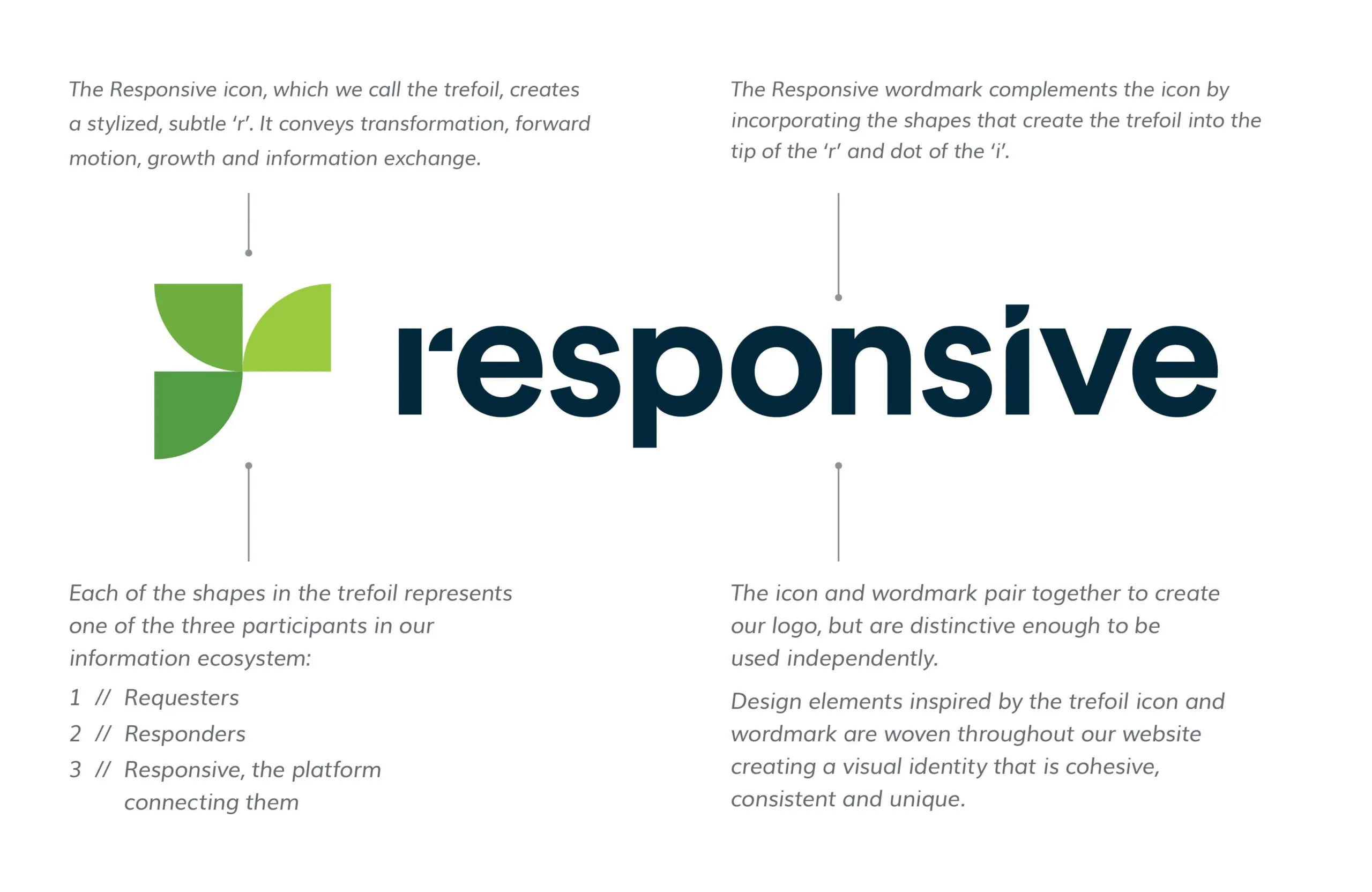
WD: The new logo consists of an icon and wordmark allowing for greater flexibility in how we use it. The icon is made of three rounded triangle shapes — inspired by RFPIO’s signature arrow — in bold shades of green which create a subtle, stylized ‘r’.
We call this the Responsive trefoil. The three shapes represent the parties involved in information exchanges: requesters, responders and our platform that connects them. The three ascending shades of green and the forward spiraling motion of the trefoil represent the flow of information as well as the growth and transformation our platform delivers to our customers.
Additionally, you’ll see the trefoil shapes echoed in our wordmark as the tip of the ‘r’ and the dot of the ‘i’. These shared elements make for a very cohesive and distinct logo and allow for brand consistency when paired together or used individually.
What other visual changes accompany the new name?
WD: Having the new name and logo, we wanted to carry through the idea of growth, momentum and connection. With that, you’ll notice a few changes including updates to how we use our color palette, the incorporation of the trefoil and a shift in how we illustrate the platform.
Our color palette
The Responsive brand still leads with our signature green as the dominant color. However, we’re using our vibrant, secondary colors in new ways. By incorporating lighter backgrounds paired with high-contrast, bold colors we enhance the brand’s approachability and draw the eye in. For those who knew us as RFPIO, this palette will feel familiar, but by updating how we use them, we create a fresh look.
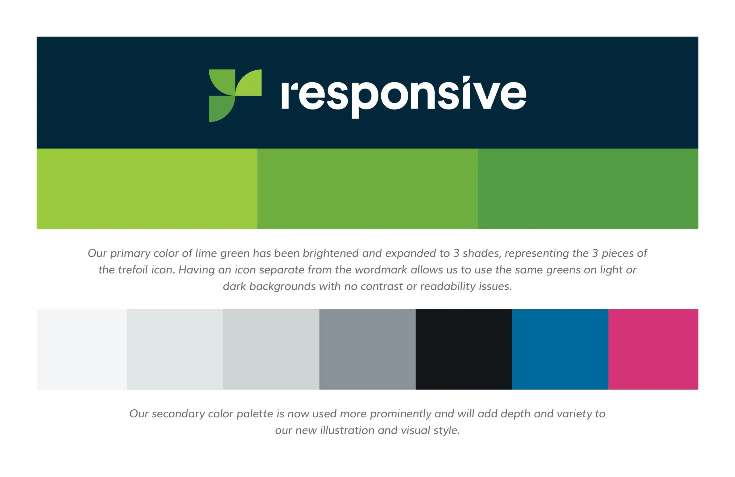
The trefoil
Forward momentum has always been part of the company’s brand. We’re pushing forward into the future, evolving, growing and helping our customers do the same. Accordingly, you’ll see this movement reflected in the new logo and throughout the new site design.
I may be biased, but from a design perspective the trefoil is the perfect shape. It plays off the angular point of an arrow offering a strong direction and indication of growth, but also has a curve that gives it a sense of movement. At a small scale, we can use the trefoil as a detail in illustrations. And, at a large scale, we can use the curve to create flow within web pages and image designs. The trefoil really gives us a foundation and creates cohesion between brand elements.
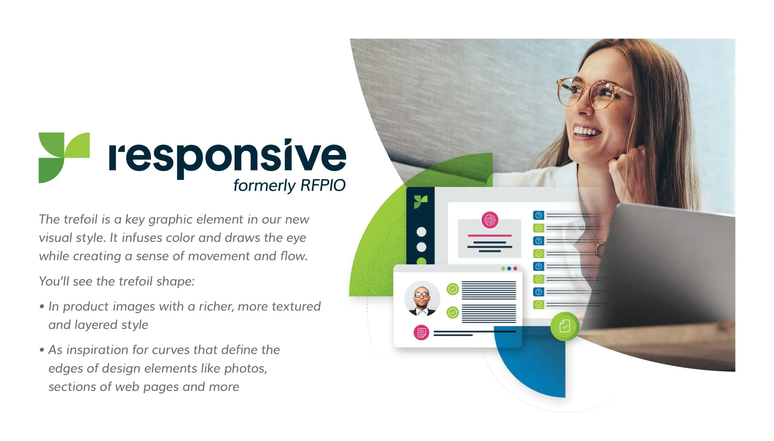
Platform illustrations
Obviously, depicting our software and communicating its value through imagery is crucial. The previous isometric style leveraged screen shots and product elements angled at an intersecting grid mimicking the point of the classic RFPIO arrow.
We wanted the new visual design to be more dynamic, even in our static images. The Responsive illustration style is more direct, layered, textured and engaging. We use these elements to highlight product details and connect the end user to the value we deliver.
Evolve and grow with us
In the next few months, you’ll see more about Responsive on our website and social media. In addition, we’re still working hard to deliver even more value and innovation within the Responsive platform. So, join us and follow along. Be part of our story, because the best is yet to come.

Bethany Runyon
Senior Content Strategist @ Responsive
Bethany is a senior content strategist at Responsive. She has a background in sales and marketing and is passionate about empowering others with knowledge and technology.