AI-POWERED RFP SOFTWARE
Fast, trusted answers that win deals
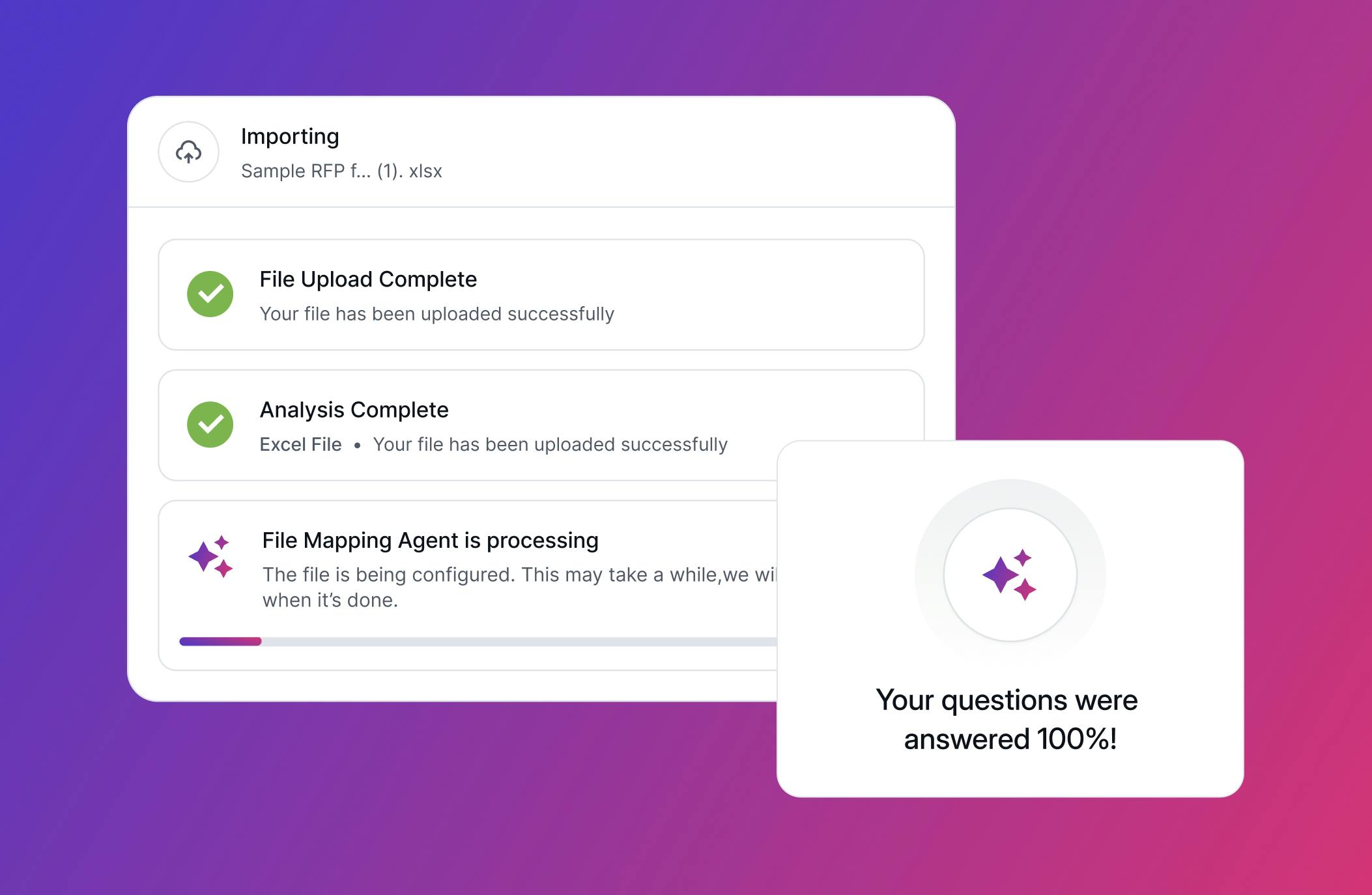
Responsive AI uses your best content, guided by subject-matter experts, to power sales and proposal teams across RFPs, security questionnaires, and buyer questions.


Company Performance Metrics
The leader in response intelligence, trusted worldwide
$1Tn+
in total opportunities managed
25+
of the Fortune 100 use Responsive
8.7M+
Q&A pairs maintained on the platform
2000+
companies around the world
The AI platform for every team in your organization
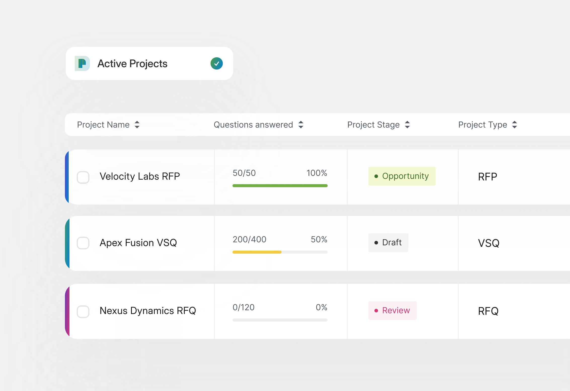
Bid & Proposal Managers
Responsive AI drafts your answers and manages collaborative workflows so you can deliver winning responses to RFXs, questionnaires, and assessments 80% faster.
trusted by the best
#1 RFP response software on G2 for 4 years and counting


Unlocking knowledge to drive profitable growth

“Responsive is the best way for us to democratize knowledge across our organization and dealer network. It is so important that everybody has access to this knowledge and information, so they represent us accurately in the marketplace.”
Learn more about Crystal FiedlerCrystal Fiedler, Director, Sales and Design Technologies Team, Haworth35-50%
time savings per project

Crystal Fiedler
Director, Sales and Design Technologies Team, Haworth

“For every $1 that Microsoft invests in my team, I estimate a return on investment of $746. In the last year, the team contributed $8.5B in revenue. We have seen really massive growth over the past few years and we couldn’t have done it without Responsive.”
Learn more about Microsoft logoCarrie Jordan, Global Director of Proposals at Microsoft$17M
saved in response cost
21,100
hours saved in response time

Carrie Jordan
Global Director of Proposals at Microsoft
“Responsive AI has been a true force multiplier. It excels at tackling those complex, multi-part questions and ensures the entire response is consistent and coherent. We're shaving days off our delivery time, while maintaining high-quality, consistent results.”
Learn more about Tenable logoVicki Bokhari, Proposal Manager of Global GTM Operations at Tenable70%
win rate
2,320
staff hours saved quarterly

Vicki Bokhari
Proposal Manager of Global GTM Operations at Tenable
“As a proposal manager, I appreciate a well thought-out response. Responsive was the only vendor that provided a comprehensive, thoughtful, non-boilerplate, strategic response that was clearly written for us. It answered every question thoroughly.”
Learn more about Becky BeardBecky Beard, Global Proposal Team Manager at Qualtrics1000
SMEs and field sellers using Responsive AI
50%
faster drafts

Becky Beard
Global Proposal Team Manager at Qualtrics
“It could take 5 to 10 minutes to manually find something in the library or to take two things and merge them together. With AI Assistant, it is actually answering, on average, our questions in 30 seconds.”
Learn more about Netsmart logoAndrew Mersman, Senior Director of Solution Consulting at Netsmart67%
increase in proposals submitted
93%
RFP go-forward rate

Andrew Mersman
Senior Director of Solution Consulting at Netsmart

“(Responsive) makes salespeople aware that not only do we have this great team working for them, but we have this great platform that can serve them in any part of their sales cycle. “
Learn more about Payscale logoNick DeMarco, Sr. RFP Content Writer at Payscale25%
reduction in response creation time

Nick DeMarco
Sr. RFP Content Writer at Payscale
The Strategic Response Management platform
that sets the standard
Responsive AI agents are digital specialists powered by insights from over $600B in managed opportunities and 3.2M Q&A pairs — working seamlessly alongside human experts.
Strategic resources for strategic response teams
Featured
The 2026 State of SRM Report
Discover how leading orgs are seeing shorter sales cycles, greater revenue, and happier employees.
Read the report
Webinars & Events
Meet Responsive on the road, check out upcoming webinars, and explore our on-demand library.

Blog
Stay in the know and learn from experts on Strategic Response Management.
The 2026 State of SRM Report
Discover how leading orgs are seeing shorter sales cycles, greater revenue, and happier employees.
Webinars & Events
Meet Responsive on the road, check out upcoming webinars, and explore our on-demand library.
Blog
Stay in the know and learn from experts on Strategic Response Management.